How do your customers view your website?
desktop. tablet. smartphone. don’t know?
If you check the visitor stats of your website using Google Analytics you’ll probably be surprised just how many people are already visiting your site from a mobile device. Then compare this to a year ago and you’ll see that the trend is increasing. Typically you’ll find 20 to 25% of your site visitors today are using either a smartphone or tablet as opposed to a desktop PC to view your website, and it is anticipated that in the next year or so this figure will exceed 50% for the first time.
So what?
Most smartphones are pretty good these days at allowing you to view almost any website, but is it really a good user experience? When you look at your site on a phone do you constantly have to zoom in and out to read the content? Are the menus easy to use with a finger rather than a mouse? Are the images so small you can’t really make them out?
If you’re not running Google Analytics (or another web stats package) on your website, you really should be! It provides a vast amount of information on how your visitors interact with your website allowing you to make informed decisions about how to improve your site. Contact us if you want assistance with adding analytics to your site and understanding how to interpret the information.
How to check mobile visitors with Google Analytics
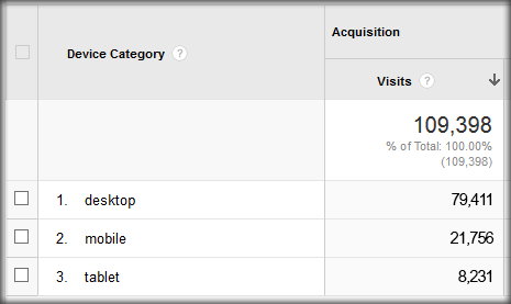 Once logged into your Google Analytics account, go to ‘Audience’ in your standard reports and select the Mobile Overview report. From there you can see the split between desktop, mobile and tablet visitors and then drill down to exact devices your visitors are using to view your site.
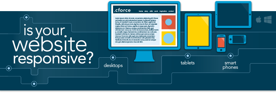
Is your website responsive?
no. yes. maybe…not sure what that means?
The (recent) history of responsive design
The term “responsive site” is fairly recent, since it first appeared in the famous article by Ethan Marcotte at alistapart.com in 2010. Marcotte explains that web designers and developers should finally “forget” about the traditional way of working, which is a relic of the print industry and is based on the assumption that we know the format and the dimensions of the required project beforehand (i.e. the design of an A4 advert (297x210mm) in a magazine). The nature of the web and the vast range of different devices with different screen sizes that access the internet invalidate this assumption. Marcotte asked the web community to embrace this change and adopt a flexible, dynamic and fully adaptable approach in web design. He coined the phrase “responsive design”.
So what actually is responsive design?
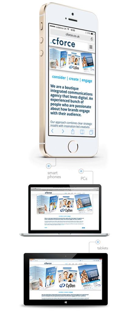
In effect it is a series of techniques that allow us to build web pages that dynamically adapt “on the fly” in each dimension and orientation of each screen (i.e. desktop, smartphone, tablet etc.). Responsive design can completely change the structure, layout, images, font sizes and of course the content of a web page. A website actually fits in every dimension, changing so that the user always sees the most appropriate version for the device they are using. All of these changes are triggered by the screen resolution of the user’s device. So a website layout will dramatically change for a smartphone screen compared to a desktop one.
What are the advantages of responsive design?
-
Improved user experience (UX)
The main advantage is to offer a positive experience to your users, regardless of the means and ways they access your site. -
Cost
Although the cost of building a responsive website is more compared to a traditional one, this solution is far more economical that trying to create and maintain separate websites and applications for each device. -
Future-proof
A responsive website will adjust to any new device or resolution, even new devices that aren’t available yet. -
Maintenance
The maintenance and updates of the content is easier since you are managing just a single website. -
Consistency
Offer to the user the same feel, brand, design and content regardless the device they are using.